Howdy, Stranger!
It looks like you're new here. If you want to get involved, click one of these buttons!
If you use an @yahoo.com email or any related Yahoo services, they have blocked us also due to "user complaints"
-UE
Modern Dungeons and Dragons art standards

As a huge fan of Dungeons and Dragons monsters (more so than the game itself) I've been reviewing them on my website and discovering that I usually completely hate their most recent redesigns. Yeah, you can accuse me of nostalgiavision, but whether or not you're familiar with the game or its art, take a moment to compare these monsters:
Glabrezu:
Thought Eater:
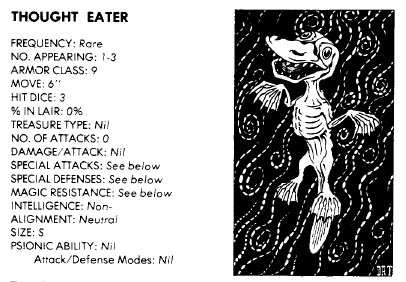
Carrion Crawler:
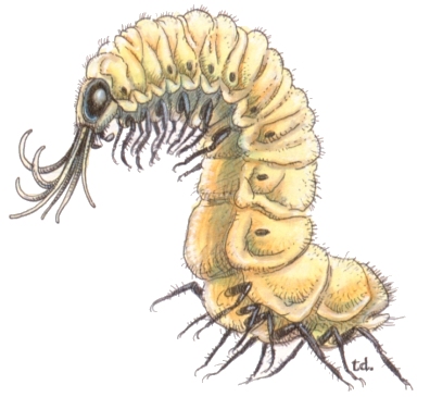
I could go on and on, but you get the idea. Which of these would you say look like they come from a whimsical, magical fantasy world and which ones would a ten year old want to be when they grow up?
All my favorite monsters were the strangest and silliest. They had character and imagination. In third and fourth edition, all those same monsters (if used at all) were given slavering dinosaur jaws, neon red eyes and bladed exoskeletons. They're trying so damn hard to be "cool" that half of their art looks like someone tried to imitate GWAR without realizing that GWAR is supposed to have a sense of humor. Like a stuffy corporate executive's idea of what "the kids" think is "cool these days."
There's nothing wrong with HARDCORE X-TREME \M/ETAL designs, no, but when a franchise shifts noticeably from more atmospheric, believable and lighthearted motifs to all over-the-top attempts to look "badass" almost all the time, it feels cheap and stupid.
Comments
Definitely not animesque enough.
they remind me of Magic's art, which is obviously fitting, considering who's behind this.
I think the new Thought Eater is actually an example of better design. It genuinely looks more threatening, whereas the other new ones are a bit over the top. It doesn't help that the old Thought Eater art is pretty horrible as an actual example of the monster -- it looks like an image from folklore by someone who's heard of it second-hand. That's awesome from a narrative perspective, but doesn't give us a good idea of what the creature's actually like.
In any case, I tend to prefer designs that err towards simplicity and leanness. A scowling, muscular demon is too human -- but the same creature with exposed ribs, greyed skin and hungry eyes can be absolutely terrifying. Come to think of it, the old Thought Eater is like that, but perhaps it looks too much like a dead platypus for me to really think of it as that monstrous.
I really like the old Carrion Crawler, by the way.
I kind of like the newer art more.
Normally, I'd prefer the older art, since I do agree that it's more whimsical and silly and whatnot, and I do generally like that, but considering these are monsters that exist primarily for the player characters to beat up, I think it makes more sense to have more intimidating designs.
Wait, that's a Thought Eater? I saw that picture before and I thought it was an attempt to make a grimdark Psyduck. >_>
I have to say, the old Carrion Crawler is pretty good, but I'm quite opposed to the old Thought Eater, and I have a slight preference for the new Glabrezu; the old one is way too adorable to be such a powerful demon. I, personally, prefer my monsters to look like, well, monsters. Especially since, like DYRE said, they most often serve to fight the players to the death. I'd rather not see Dungeons and Dragons lending itself to silliness (whimsy is fine, but not silliness), and in any case there are still plenty of silly monsters to go alongside the demons that actually look like demons.
V Case in point.
Second one says whimsical and mysterious looking to me, which neither one feels to me, but the older one seems to get closer
The third one I am partial to neither design
I feel it's like Pokemon in that way. The designs are often hit or miss, and somebody complaining about all of them needs to take off their rose tinted glasses for a second
I've been through five generations of Pokemon, discovering the internet fandom at around the third generation. Three generations of complaining about new designs when most of the designs are fine
So I'm sorry if I seem unsympathetic, but I believe you will get over this, just like how the Pokemon fans get over the new Pokemon apparently looking like Digimon
The Thought Eater shouldn't have to look threatening. Its concept is that it exists on the ethereal plane, completely imperceptible, and actually has no intelligence at all - they even use the words "effectively stupid" in second edition - but it's mindlessly drawn to consciousness it can smell in our world, and will literally eat your thoughts until you're nothing but a vegetable. If someone actually bothers to peer into the Ethereal plane, what do they see? A sad, pathetic, ridiculous little platypus-like ghoul, obliviously sucking away consciousness as food. That's BRILLIANT. In fact, describing it now, I think it's my favorite concept ever in the game.
Well, it's a demon that's supposed to be an expert in treachery, deception and manipulation, particularly when it comes to the classic demon art of tempting mortals into questionable deals and granting their evil wishes. You have to be screwed up to trust a black dog with crab hands, sure, but is anybody stupid enough to bargain with the other one?
I think it's a totally different situation. We're talking about the "canon" of a design being completely overhauled in an extreme way. Absolutely nobody would put up with that from Pokemon or Digimon, and nobody has ever had to, which is why complaints about new generations are completely stupid... Slowbro has remained Slowbro for fifteen years. Venonat still looks like Venonat. They add new monsters in new styles instead of messing with the old ones.
Reinterpreting monsters is fun, but if the original concept is an eerie, haunting phantom, what rhyme or reason goes into suddenly portraying it as a fanged, hairy vampire?
I forgot two of the very worst examples of all:
This is a "weird." From the 70's to the 90's they were elementals manifesting as snake heads which rise from water, earth or other substances. As of the third edition, Weirds are idyllic female humanoids.
Oh, and the 4th edition Lamia. Instead of a woman with the lower body of a snake, they're now swarms of killer scarab beetles who take human form. That's an awesome concept I can totally egt behind, but there's no reason at all for it to be the replacement for the game's classic Lamia.
Well, in the case of the glabrezu, it's one of the more powerful creatures in the demonic hierarchy, but its old design doesn't even slightly reflect that. It's way too cutesy for a powerful demon. I'll grant that the newer art kind of misses the idea behind it as well; it's supposed to be a creature that tempts mortals with offers of power--conniving, and seedy, and stuff. It has some fancy bling, sure, but so does the Goristro, and that monster's basically just a living siege engine. Neither version of the Glabrezu's art reflects that aspect, but the newer art at least gets the frightening, imposing, and most importantly, demonic appearance correct.
Considering that its appearance suggests much greater power than the former design, I would actually imagine a fair number of people being stupid enough to fall for it. More so than the goofy dog-headed wretch, in any case.
I'd take the older Glabzeru over the new one any day. The new one is a pretty shitty demon, in my opinion -- all brawn and nasty bits with no actual menace.
It's easier to say it's not menacing when it's looked at on paper, though. Seeing demons portrayed in such an admittedly excessive fashion has probably jaded us to it, but I would imagine most people being much more frightened to be face-to-face with it than the older one. And those who aren't frightened off would probably feel that its appearance actually suggests power. There's relatively little menace in the old one.
You know what I'd like to see? The old concepts, drawn by the new artists.
Uncanny valley is that thing.
I prefer the newer art. The older art had them all just look like animals rather than actual monsters.
>Talking about D&D while watching Colbert report
>Colbert references D&D and says 'some of you know what I'm talking about'
Yeah, fuck you too Colbert.
^You were taken to some pretty fucked up zoos as a child, weren't you.
The lamia thing is stupid, but other than that I have to say the modern stuff looks better overall.
I liked AD&D 2E's art. It seemed to scream "ADVENTURE" and flail its arms wildly. The PHB from that time depicts a barbarian busting down a door and howling, and all the characters look like they leaped out of either a Frazetta painting or an illustration of Robin Hood.
There's a charming enthusiasm to it that a lot of modern stuff has lost, but on the whole the art of older editions really were just poor in quality, not to mention sometimes rather eyebrow-raising in a bad way.
I'm not a D & D player at all, but just looking at the pictures I can see that some of the older pictures did have a certain charm that some of the new ones don't. Some of the new ones are improvements though.
The really radical step would be to have no illustrations at all though - just describe the monsters and let the players use their imagination.
I'm not sure that would necessarily be an improvement. Prose descriptions can often be imprecise. With a picture at the very least everyone has a consensus on the basic physical aspects of the monster.
It depends on the type of game.
I think there would be a bad reaction to that idea in D&D circles -- horror stories concerning the limitations of a significant portion of the D&D playerbase are common -- but it would probably work better for games that thrived on mystery and the unknown. Call of Cthulhu is one example, but World of Darkness and Riddle of Steel are just as easily benefited by that approach.
WoD is too attached to its pretentious porny images for that.
Kind of a shame.
I mean we all know that WoD isn't ALL GOTHFAGGOTRY ALL THE TIME and is more of a highly variable urban fantasy than anything, but it's unfortunately built an image around the worst stereotypes of modern urban fantasy that leans into horror.
It's a large part of why I prefer Old World.
Old world didn't lack the pretentious porny stuff but it was also big-minded enough to include the reality-bending stuff and include self-aware Hammer Horror stuff.
nWoD has done its best to throw away the campiness or really out-there concepts which is a really bad place for a freeform Urban Fantasy setting, if you ask me.
ITT reasons why Mage, Changeling and Hunter are my favourite concepts
I love Hunter as a concept. It's just that every time Whitewolf gets a chance to handle a concept that seems pretty simple to me they fuck it up horribly.
Old Mage is amazing, beautiful ideas with a system that does its best not to get in the way.
I could never get into WoD. Even though I'm big on roleplaying, the idea of having a party of nothing but vampires or werewolves - even multiple types of monster - doesn't appeal to me.
I could see myself getting into Hunter, though.